TFT Revival Ladder
Progression visual system for TFT Revival Ladder: nine ranked emblems, end-of-game reward pickups for mobile and PC, and the Event Hub where players track their climb. Built to ship for multiple Set Revivals per year. Now in its fourth run, using the same system without modification.


TFT resets every 4 months. New mechanics, new champions, new synergies. Each set is a new game. That keeps mastery-driven players engaged. It loses the casual ones. By mid-set, players who cannot keep pace with the meta have plateau'd in rank and lost their goal. Set Revivals bring back old sets to re-engage them. Familiar rules, lower barrier, a game they already know how to play.
But they still need a reason to keep playing beyond nostalgia. That reason is Skill Tree, a progression system where even finishing last earns you points. Skill helps you climb faster, but it is never the only way forward.
The visual problem was the tension inside that idea. The system had to feel competitive enough that players take it seriously, and casual enough that the players ranked left behind are not afraid to enter it. Too close to ranked and it carries the same intimidation. Too light and no one invests. The visual language had to hold both at once.

Before designing anything, I mapped every ranked visual system players already knew. League of Legends Ranked and Wild Rift ranked. TFT core ranked. Return Set ranked. Four systems, four visual languages: wings, traditional banners, heavy metal frames, dials. I documented all of them as anti-references. The constraint was not aesthetic preference. It was product logic: if players associate these visuals with ranked pressure, the system fails before they play their first game.
The product distinction gave me the visual answer. Revival Ladder keeps the competitive charge and drops the rank. I did not go to trophy systems, but went to esports. Explosive energy, high-contrast motion, the charged visual grammar of competitive broadcast. That became the standing rule for every emblem.


Three tiers, nine levels, the progression lives in the base, not just the color.
- Water (Apprentice, Guide): fluid motion, compact and grounded.
- Fire (Expert, Guru, Scholar): energy that starts to catch and rise.
- Lightning (Sage, Oracle, Visionary): bolts radiating outward like a crown expanding.


After every match, the emblem appears on the reward screen. This is where the tier design does its most direct work. At Water and Fire, the emblem is centered and contained. The player sees where they stand. At Lightning, the radiating base takes over the frame. The energy that was decoration at lower tiers is now the dominant visual. The player has not just filled the system. They have broken through it.
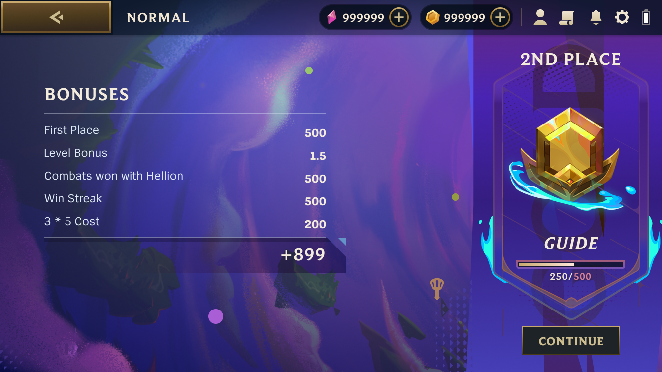
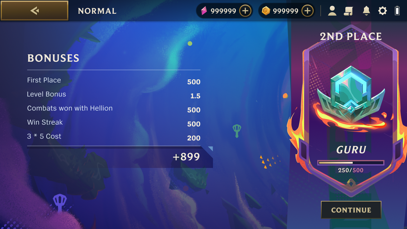
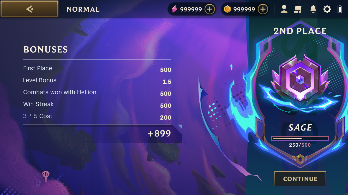
Between matches, players return to the Event Hub to check their rank, claim rewards, and choose which Skill to activate next. The hub had to function as a destination, not a dashboard. The Skill selection is part of the game. Which modifier fits how you play today. The design had to make that feel like a choice inside the experience, not a menu outside it.
The system has shipped across four events. I kept the core elements neutral. No set-specific iconography baked into the UI structure. Each event swaps the background and the color of the banners. The emblems still hold.
- Launched, late 2024
- Remix Rumble
- Dragonlands
- Festival of Beasts
It was designed for one set. It became the standard for all of them.
